The home of architecture and design in Asia-Pacific
Get the latest design news direct to your inbox!
Get the latest design news direct to your inbox!
The architects of the Cabrini Hospital in Melbourne, Australia envisaged wards that feel both polished and hotel-like in quality. But it’s the focus on safety requirements and functional needs of patients and staff that really shines through.

The New Clinical Building by Bates Smart in the Melbourne suburb of Malvern is anything but clinical. The seven-storey building (with an additional four levels below ground) could be mistaken for residential apartments with its timber-battened façade. Forming the new building is the Gandel Wing at Cabrini Malvern, responding as much to the latest changes in technology as it does to the surrounding leafy neighbourhood and its demographics.
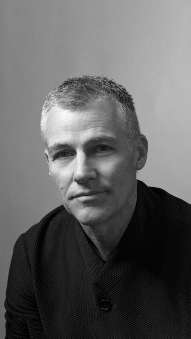
“We’ve been working on this hospital campus since the 1980s. This time, it was about strengthening connections to our previous centres (Medical Centres Two and Three) as well creating this new wing, including the provision of over 100 new beds,” says Mark Healey, studio director at Bates Smart.

Replacing a two-storey concrete consulting wing from the 1980s, the new wing will accommodate patients in the specialty areas of radiotherapy, cancer, cardiac, maternity, emergency, geriatric care and infectious diseases and importantly, will provide valuable new pathways that allow other areas within the hospital campus to benefit.
“We wanted to use the ‘DNA’ of the other two centres we designed at Cabrini Malvern to feel integral to this latest development: streamlined, contemporary and uncluttered,” says Healey, who was mindful of the demographics in the immediate and broader environment he and his team were working with, reportedly one of the oldest cohorts in Melbourne (City of Stonnington).

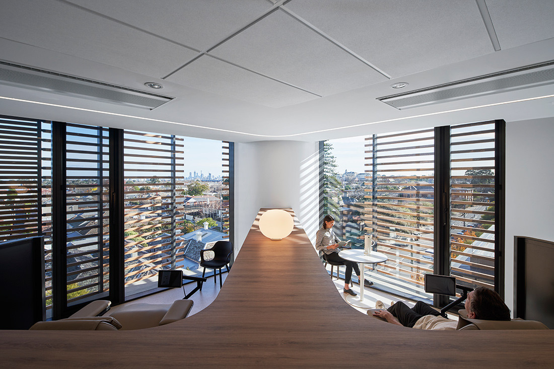
“We also wanted our design to better connect to nature,” says Healey, who included large floor-to-ceiling picture windows at the end of passages to allow people a sense of the outdoors from within.
“It’s also a way of orientating people as they move through the building,” he adds.

From the moment patients and visitors arrive via Isabella Street, into a courtyard-style garden entrance, there’s a sense of both clarity and softness, eschewing any hard rectilinear lines.
Lights are thoughtfully placed below handrails along with ceiling lighting that creates a softer environment than what’s normally experienced.
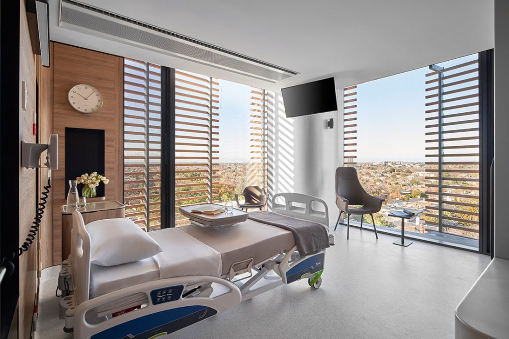
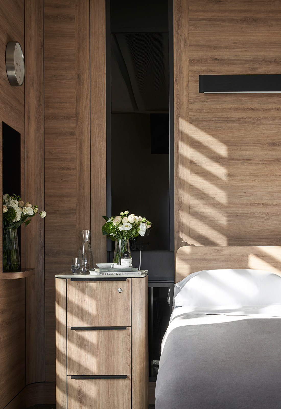
“We reduced the lighting to 3000K (the usual is 4000) to create a more calming ambience,” says Healey, who also included soft rounded corners on all levels. The oak timber laminate used for the public areas can also be seen within each bedroom suite.
Gentle alcove lighting, carefully articulated shadow lines, and unimpeded sight lines between a patient’s bed and their bathroom could not be clearer, with sensory lighting activated when a patient gets up to use the bathroom during the night.
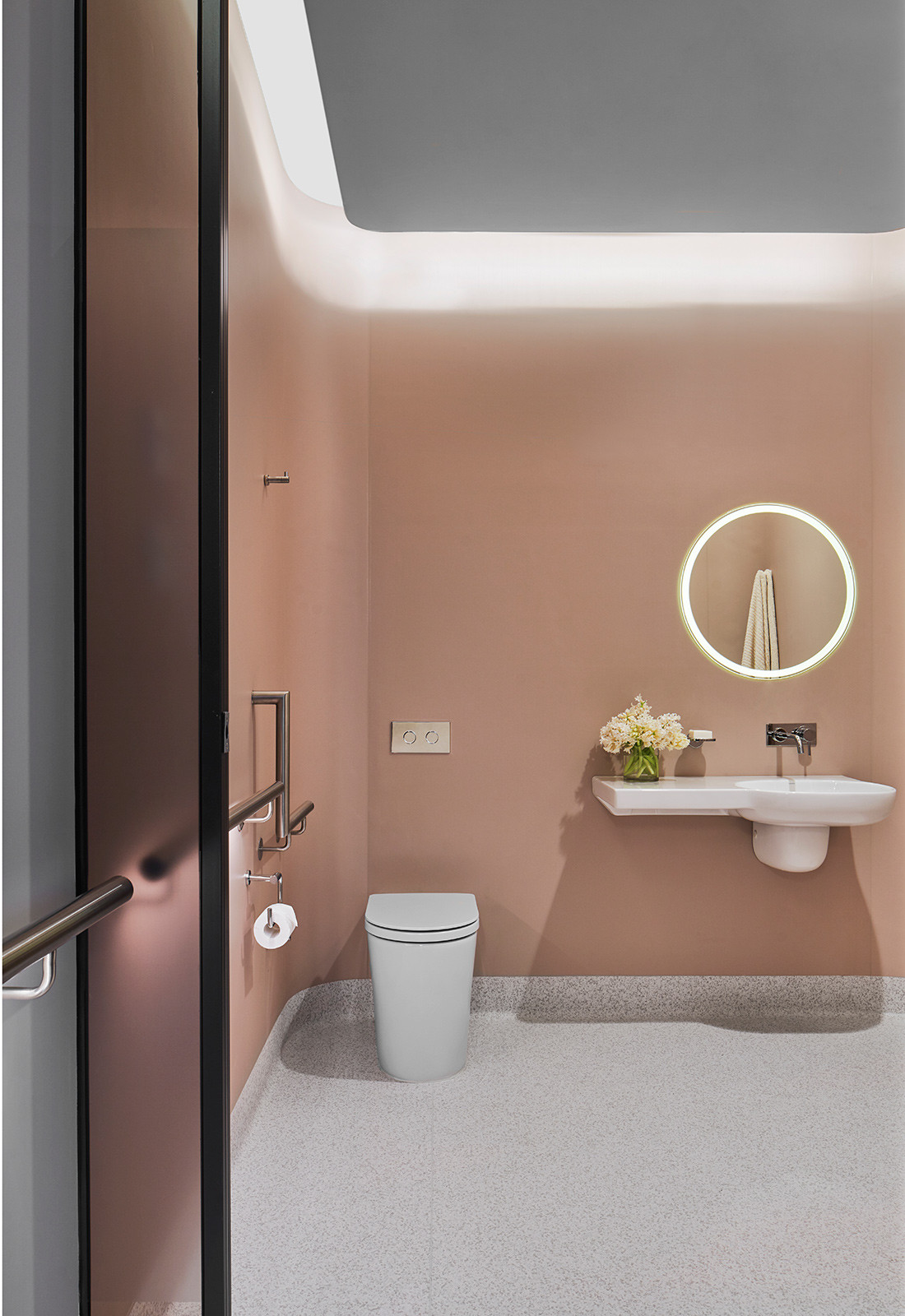
“Evidence highlighted to us that it is at that time when most accidents occur, with patients falling and being disorientated,” says Healey, who created the same rational approach in designing the ensuite bathrooms. Curved walls, seamless vanities and uncluttered floors and walls, void of glass shower screens, ensure patients are as safe as possible at all times of the day and night.
The rooms also feel far from clinical, with bronze-tinted glass entry doors and floor-to-ceiling windows that frame the leafy neighbourhood. The central pod, containing the built-in wardrobes and basin, is as streamlined, with any equipment concealed.
“We also took that approach with shelving concealed behind tinted glass,” he adds.
Bates Smart was also keen to increase the comfort of patients needing to use the Infusion Treatment Unit on level four. Twenty-eight chairs, the type one might experience in a first-class airport lounge, are discretely arranged behind tinted bronze glass privacy screens that can change in the degree of transparency with the flick of a switch. “
We’ve organised these chairs at a forty-five-degree angle so that patients can control whether they want total privacy, or feel part of being in a larger space, with views beyond,” says Healey. “One of the most important aspects of delivering services such as these is creating the highest level of hygiene possible,” he adds.
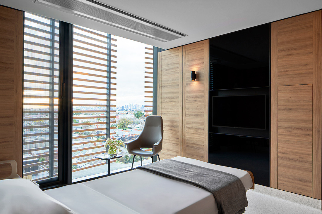
In addressing all these imperatives Healey refrained from using curtains, instead relying on tinted glass; selected external terracotta baguettes; and carefully curated bed, chair and table placement.
Beds in individual rooms, for example, are orientated to ensure sight lines are through the terracotta baguette rain screen. Likewise, those passing by a room do not see a bed from a doorway. Just as considered are the breakout spaces provided for family and friends and staff. Each level, for example, has a built-in bench-height desk at reception to allow staff to meet informally.
There are also rooms where families can meet, along with two courtyard spaces where mothers can feed their babies should they have a toddler begging to be taken outdoors.
“When we’re designing these types of spaces, we’re always mindful of making them feel as normal as possible, a welcoming place that fits comfortably into this neighbourhood,” says Healey.
This article originally appeared in issue #79 of Indesign magazine – the ‘City Futures’ issue.
A searchable and comprehensive guide for specifying leading products and their suppliers
Keep up to date with the latest and greatest from our industry BFF's!
The internet never sleeps! Here's the stuff you might have missed