The home of architecture and design in Asia-Pacific
Get the latest design news direct to your inbox!
Get the latest design news direct to your inbox!
Steeped in the rich tradition of Dutch design, Scholten & Baijings’ latest projects push the boundary for colour in design thinking.


When it comes to Dutch design, ‘colour’ is not often the first thing that comes to mind. Consider the rich, dark hues of Marcel Wanders’ interiors and products, the concrete and glass of OMA buildings under Rem Koolhaas, the pastel hues of Viktor and Rolf: synonymous with innovation and playfulness the Dutch scene may be, but it is also tinted with a relatively muted, restrained colour palette. Soon this may no longer be the case, with design studio and husband and wife team Scholten & Baijings going from strength to strength in their bold, colourful design practice.
Since founding Scholten & Baijings in 2000, the eponymous duo have worked across a diverse range of mediums from product and furniture to graphic and exhibition design. The frequent travellers traverse the globe for inspiration, collecting numerous accolades on the way: Scholten & Baijings have won a number of high profile awards, including the Dutch Design Award, Wallpaper Design Award, and the ELLE Decoration International Dutch Design Award.
Equal parts playful and pragmatic, the approach sees Scholten & Baijings make their own materials, colours, and models, and then critically examine these to assess whether the idea is really working or would be better suited to a different form or reconfiguration. Thanks to this iterative, process-oriented methodology, Scholten & Baijings’ portfolio is reliably innovative, employing palettes that are fresh, clean, and strikingly unique.
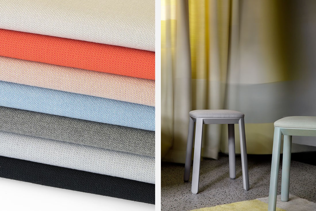
Most recently, the pair has focused their attention on textiles, collaborating with leading global textile supplier Maharam to produce a collection of three fabrics that has since been nominated in the fabric category of the ELLE DÉCOR International Design Award. The three new fabrics were released earlier this year to coincide with the global launch of ColourForm Sofa Group, Scholten & Baijings’ inaugural furniture collection from Herman Miller, and reflect an idiosyncratic fluency in pattern, texture, and colour. Added to this is a sense of depth and dimension that hints at a unique three-dimensional design approach.
The first of the three fabrics, Mesh, draws its inspiration from Scholten & Baijings’ 2014 ‘Strap Chair’, itself a reimagining of 17th century Dutch cane or woven seats. Like the Strap Chair, Mesh features a modified checkerboard pattern that weaves together rectangles of ribbed texture with smooth stacks of compact colour. The resulting pattern is punctuated by crisp stripes of fluorescent colour. A blend of cotton, solution-dyed nylon, and recycled polyester, Mesh is available in 8 different colourways that blend a restrained, cool palette of grey and green with accents in bright reds and oranges.
Similarly, Tracery is the result of a different three-dimensional process undertaken by Scholten & Baijings in their studio. Painted chipboard was notched and wound with four different coloured threads – two on the bias and one each on the horizontal and vertical axes. Tracery emulates the pattern that the threads defined, and bears a finely quilted diamond structure that is only visible on close inspection. The textile looks like a solid from afar, and is available in a spectrum of cool tones that include pale blue, sage, and graphite.
Conversely, Pare is actually a solid textile – the first, in fact, that Maharam has created with a collaborator. To create Pare’s finely textured surface, Scholten & Baijings hand painted strips of canvas to achieve the desired colour and dyed the textile to match. It was during this dyeing process, in which the different absorption properties of various fibres were exploited, that Pare’s faintly gridded, pointillist surface came to light. This unique surface is suitable for neutral and brilliant shades alike, and is available in seventeen matte colours ranging from warm pink and plum to cool grey and dark denim.
When designing, Scholten & Baijings hold themselves to “The Power of Ten”, a sort of ten design commandments that inform their practice. Included in the list are “Create our own colours”, “Use constructive thinking”, and “Stay persistent”. The list also includes “Be authentic”, and “Be Dutch”, two standards that Scholten & Baijings certainly achieve with flying colours.
A searchable and comprehensive guide for specifying leading products and their suppliers
Keep up to date with the latest and greatest from our industry BFF's!
The internet never sleeps! Here's the stuff you might have missed