The home of architecture and design in Asia-Pacific
Get the latest design news direct to your inbox!
Get the latest design news direct to your inbox!
As an exploration of the concept ‘theatre of food’, Jamie’s Italian Hong Kong combines a neighbourhood vibe with a riot of colour that defines the chef’s bubbly personality, writes Martine Beale.

August 24th, 2014
Respected British chef and restaurateur Jaime Oliver has several dining establishments in the UK, as well as a chain of Jamie’s Italian restaurants, which has 35 outlets in Britain and nine located internationally including Dubai, Australia and Singapore. Now, he has opened another in Hong Kong.
Jamie’s Italian Hong Kong sits on the second floor of Soundwill Plaza ll – Midtown, a 31-storey building dedicated to top-tier restaurants and high-end shops which opened earlier this year in the buzzing foodie district of Causeway Bay.
“We wanted the best possible site to launch the brand in Hong Kong and to do that it had to be in Causeway Bay or Central,” says Jack de Wet, Head of International Design & Development for the Jamie Oliver Restaurant Group. “When the Soundwill Plaza site came up it was too good to pass.”
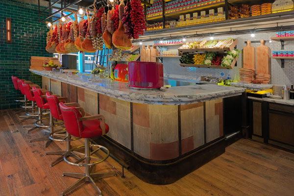
The 12,100 square foot restaurant was designed by UK-based Martin Brudnizki Design Studio (MBDS) and is set out as one large fluid space with key sections and integrated food-preparation stations where diners can chat with chefs as dishes are prepared.
The design concept draws upon elements that allude to Causeway Bay’s historical days as a fishing village, such as the sliding ship’s ladder at the antipasti bar and shipping containers in the kitchen area.
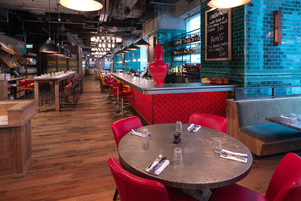
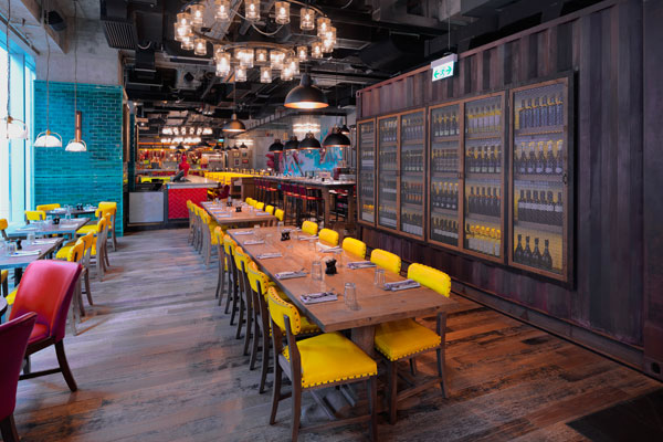
A variety of textures are used to denote different sections: sleek black tiles for the spacious open kitchen, timber flooring for the seating areas, and large cooling slate tiles throughout the entrances and corridors.
These are punctuated by vibrant colours – striking bright yellow banquettes and chairs, red bar stools and seating, Jamie’s Italian signature teal banquettes, and the Kingfisher-coloured subway tiles that are employed on columns.
“While the restaurant attempts to contextualise itself, there are certain brand elements that are consistent across the group. Strong, punchy rather than consistent colours are a trademark,” says de Wet. “We opt for bold rather than specific colours. In this instance, red was used to pay homage to cultural context.”
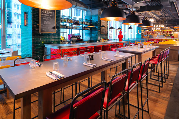
A mix of lighting is utilised throughout, from spotlights behind the food-preparation stations to industrial-style, domed metal shades over tables, and the five, two-tiered chandeliers that add a touch of glamour above the long, red tile-fronted bar. “We used a local lighting designer called Will Kwan,” de Wet points out.
“Our philosophy has always been to work with regional suppliers so that each restaurant takes on its own identity. In Hong Kong we used a local furniture supplier for all free standing and fixed furniture. Light fittings were also designed in the UK, workshopped in Hong Kong and fabricated in China.”
Adding to the vibrancy of the decor is a large Hong Kong inspired graffiti wall personalised by Jamie Oliver’s long-time friend, urban artist Barnaby Purdy.
For his one-off mural, de Wet says the artist took inspiration from the context. “There is a nymph character blowing toward Hong Kong island which emulates the typhoons that used to hit Causeway Bay, and a Chinese dragon that is protecting the ‘jewels’ of Hong Kong island. Barnaby’s pieces are content driven and he mixes traditional graffiti with more graphic mediums that make for a dynamic piece of art.”
In keeping with the philosophy of inviting regional talent to work on Jamie’s Italian restaurants, wherever they are, Oliver called on Hong Kong urban artists to submit samples of work for the opportunity to create their own wall. Urban artist Barlo was selected.
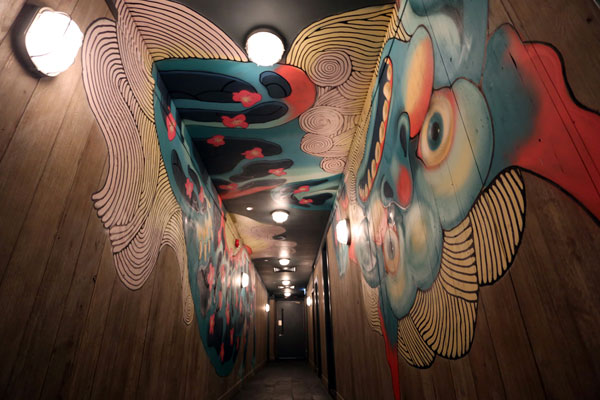
Barlo, who has been a street artist since he was 14 years old, was invited to meet with Purdy and submit a sketch of his design for the corridor area.
“The only real brief that I received was to do something relevant to Hong Kong,” says Barlo. Originally slated to take up a small portion of wall space, his colourful design was extended to cover more of the walls and ceiling. “The larger scale was ideal for me to do something much more complex and detailed.”
His design incorporates a Foo Dog, which traditionally wards off bad energy. “I picked the Foo Dog because of its relationship with mythology and tradition in the city,” he says. “Despite all the advertising, the lights, and the business, there is still some sort of spiritualism in this city. This was a challenging and fun project to work on.”
A searchable and comprehensive guide for specifying leading products and their suppliers
Keep up to date with the latest and greatest from our industry BFF's!
The internet never sleeps! Here's the stuff you might have missed